2026 Color of the Year
Why Sherwin-Williams Chose Universal Khaki for Its 2026 Color of the Year.
What does it mean for you?
Introducing Sherwin-Williams’ 2026 Color of the Year: Universal Khaki (SW 6150)
In late September 2025, Sherwin-Williams (in conjunction with HGTV Home by Sherwin-Williams) revealed its 2026 Color of the Year — Universal Khaki (SW 6150). Forbes+3House Beautiful+3Architectural Digest+3
This is more than just a new “popular paint color” announcement. It reflects broader trends in design, consumer mindset, and how people want their spaces to feel in turbulent times—calm, stable, secure. And they want a color that will be in vogue and useful for a long time. And because it is neutral, it will work with just about any other color.
Breaking Down Universal Khaki
A warm, grounded neutral
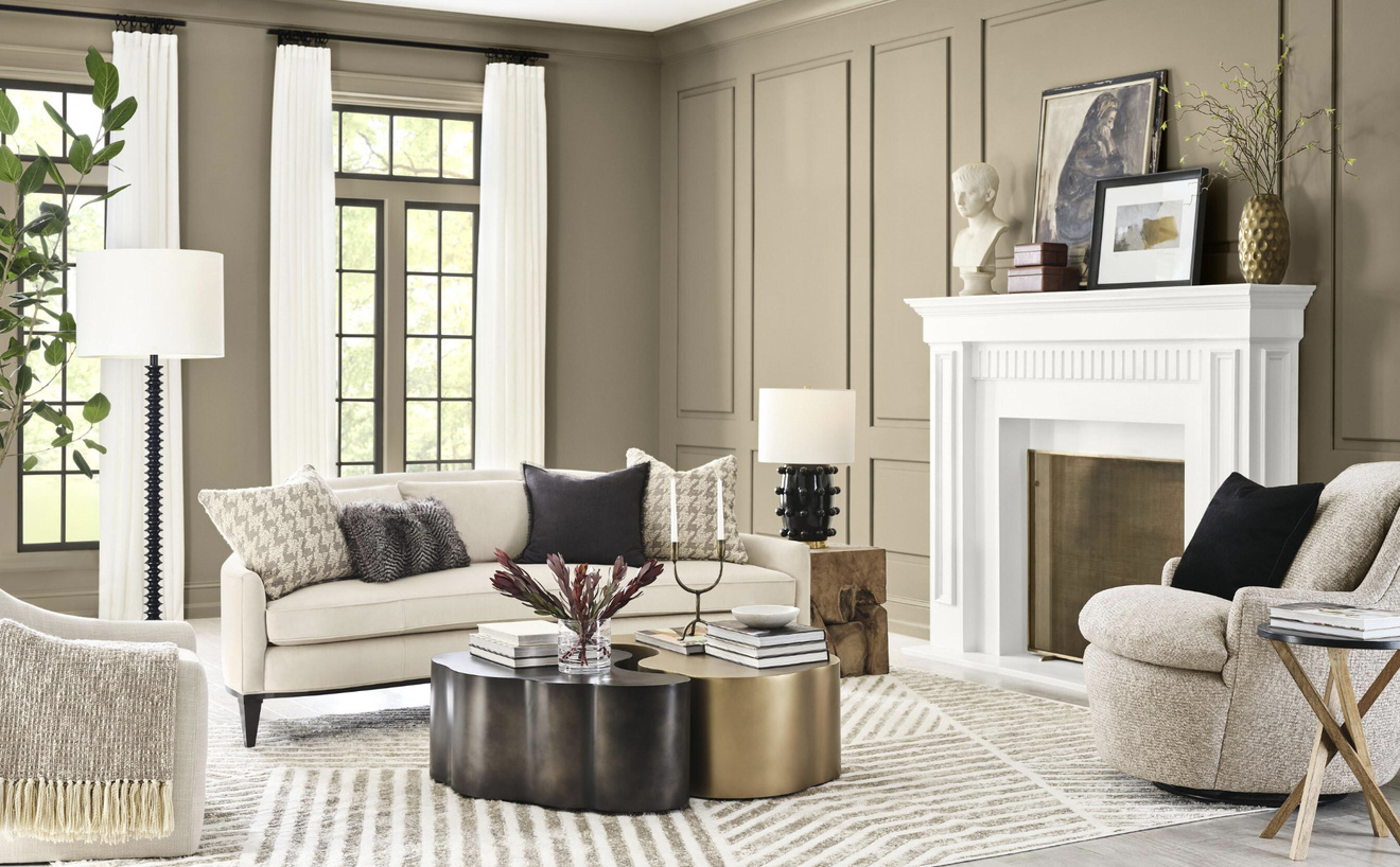
Universal Khaki is a mid-tone tan with soft, earthy undertones. It’s warm without leaning too yellow, and it carries a sense of quiet confidence — not a showy accent, but a dependable backdrop. Designers and trend forecasters say that this choice marks a shift away from cool grays and toward more “sanded neutrals” — hues that feel more lived-in, ambient, and natural.
It anchors the 2026 Colormix Forecast
Universal Khaki sits within Palette No. 4: Foundational Neutrals in Sherwin-Williams’ Colormix Trend Forecast Anthology Volume Two. That palette is one of four in the forecast, which also includes Frosted Tints, Sunbaked Hues, and Restorative Darks.
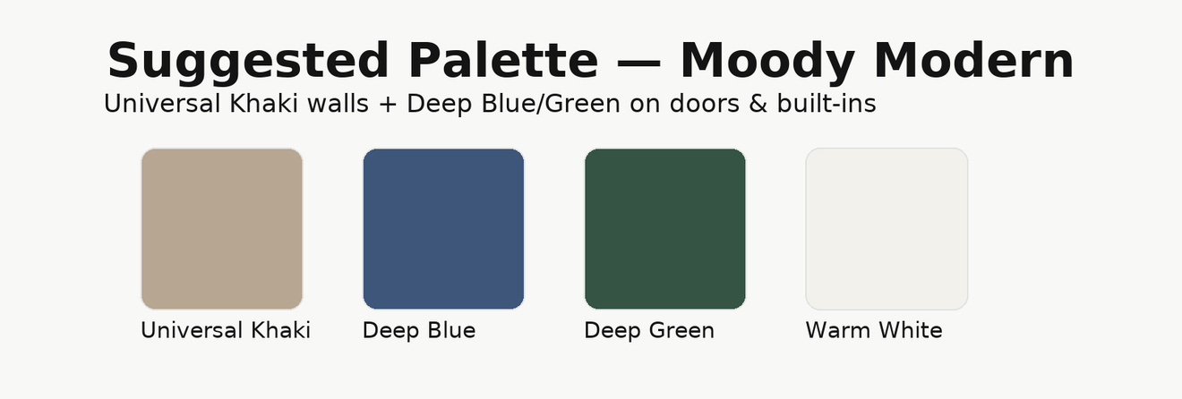
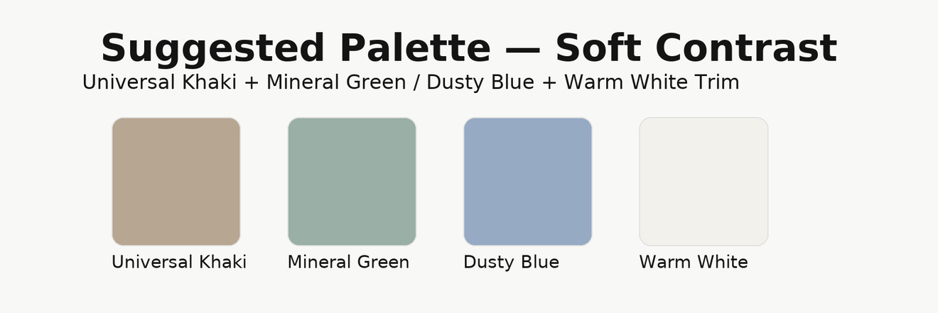
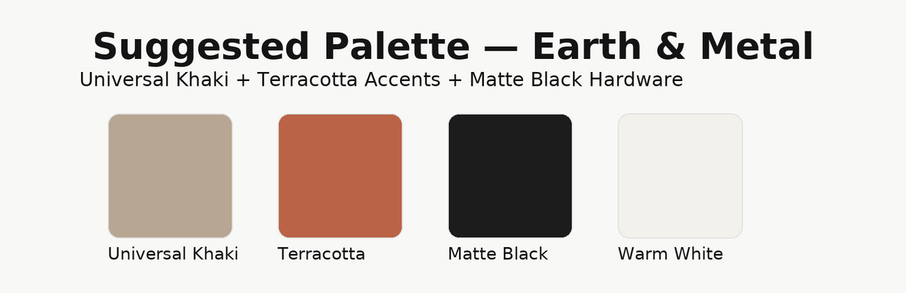
The idea is to use Universal Khaki as a base, then layer in touches from the other palettes — pastels from the frosted tints, warm terracotta from the sunbaked hues, or deeper blues/greens from the restorative darks.
It responds to the moment
In times of uncertainty or fast change, people naturally lean toward design choices that feel timeless, calming, and grounding. Universal Khaki is intended to do just that. In Sherwin-Williams’ words, it “captures the essence of life’s bare essentials,” encouraging a reset, slowing down, and designing with purpose.
Also notable: for 2026, Sherwin-Williams and HGTV Home joined forces on a unified color — a first for them — reinforcing the importance they see in consistent direction.
Paint advice
What it means for your next project
The Power of Versatility
Because Universal Khaki is subtle but warm, it pairs well with a wide range of other tones. Use it with crisp whites, deep charcoal or black accents, muted greens, dusty blues, and even bold terracottas. It’s meant to function as “the neutral that isn’t just beige.”
• Use it flexibly
• In open living spaces, Universal Khaki can help unify multiple zones (living, dining, kitchen) without forcing everything to match exactly.
• In smaller rooms, consider it on three walls and then pair with an accent wall from one of the other palettes.
• In commercial or hospitality settings, it offers a stable base for seasonal or flexible accent changes.
Educate about perception and lighting
As always with neutrals, how Khaki reads will depend heavily on lighting (natural light, artificial light, direction of windows). Encourage customers to test it in their space, in different light conditions, before committing to full coverage.